SVG, which stands for Scalable Vector Graphics, is a vector-based graphics file format that allows graphics to be displayed at any size without losing quality.
For the use of illustrations, icons, and logos on websites and applications, SVGs have proven to be an invaluable resource. Their ability to be easily customized and animated makes them a versatile tool for web designers and developers. Whether a simple hamburger icon for a mobile menu or an intricate illustration, SVGs icons provide a lightweight and flexible solution for modern web design.
Among the many uses of SVGs is web animations. From giant social media platforms like Twitter and Instagram to small SaaS websites, nearly all have adopted SVG animations. Web animations are visual effects created using web technologies such as CSS and JavaScript. These animations are usually interactive and thus improve user experience.
One of the ways of animating SVGs is via code manipulation, which is done using tools such as CSS and JavaScript.
This article will teach you how to create SVG animations using Tailwind CSS. You will also learn how to create an SVG animation in CSS and the use cases of animated SVGs.
Let’s get started!
Prerequisites
To follow along well in this article, you will need knowledge on:
Resources
For this tutorial, we will use a heart SvG icon from Hero icons.
What are SVG animations?
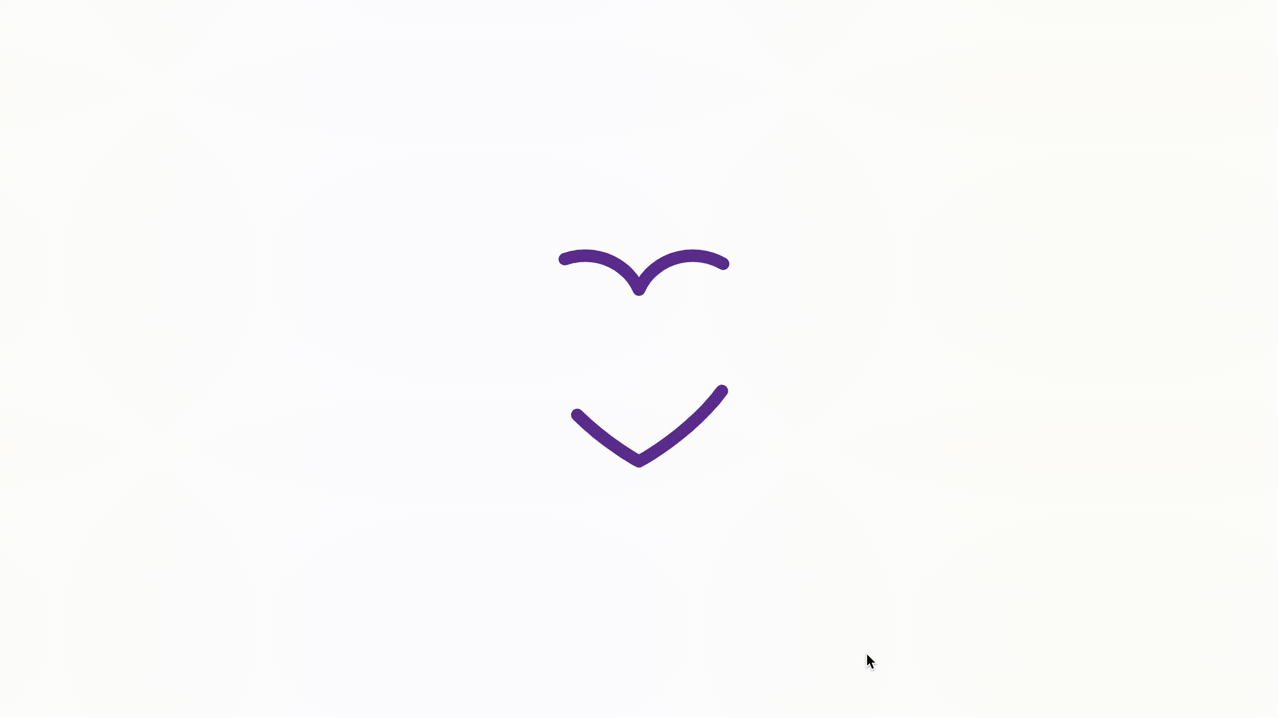
Take a look at the animating SVG below. Have you seen something like it before?
Well, if you have, that’s awesome, but if you haven’t, allow me to get you up to speed.
SVG Animations are animations created using Scalable Vector Graphics via the manipulation of SVG graphic elements such as <path/> and <circle/>.
Types of SVG animations
There are 3 main types of SVG animations, and these are:
- SMIL SVG Animations
- Script SVG Animations
- CSS SVG Animations
Let’s look at the three types in a bit more detail.
SMIL SVG Animations
These are animations created using Synchronized Multimedia Integration Language (SMIL). SMIL is an XML markup language that enables one to perform multimedia presentations on files. It provides animation elements such as <animate> </animate> that you can use to animate various SVG attributes and properties.
SMIL Animations have recently fallen out of favor due to the rise of more modern SVG animations, particularly those performed using JavaScript and CSS.
Script SVG Animations
Script SVG animations are created using scripting languages like JavaScript, TypeScript, and CoffeeScript, with the majority made in JavaScript
Developers typically use frameworks and libraries like ThreeJS and AnimeJS and sometimes vanilla versions of their scripting languages to create these animations. These tools provide greater control over SVG animations than SMIL or CSS.
CSS SVG Animations
These are SVG Animations created using Cascading Style Sheets (CSS). CSS allows the use of predefined styles and transitions to create animations. They are set off by user interactions such as hover and click.
CSS SVG animations have gained wide use in the developer community due to their support by many modern web browsers such as Chrome, Firefox, and Safari. These animations are also preferred over SMIL or Script animations since they are lightweight, effective, and less vigorous in implementation.
Vanilla CSS or CSS frameworks such as Tailwind are used to make CSS SVG Animations.
With all that said, let’s get more technical by creating some CSS SVG animations.
How to create an SVG animation using CSS
Our goal in this tutorial is to learn how to create SVG animations using Tailwind CSS. However, it would be good if you knew how to make one in CSS too. Let’s explore creating an SVG animation from scratch.
We are going to create a simple Heart SVG line animation. An SVG line animation is a kind of SVG animation where the SVG path or stroke is animated to look like it is drawing a line shape or moving.
The animation will look like the one in the gif below.

Now, to create SVG line animations, we mainly depend on the stroke-dasharray, stroke-dashoffset, stroke-width, properties. These four are presentation attributes but we use them as CSS properties.
The stroke specifies the outline color of the shape and the stroke-width defines the width of the stroke.
“The stroke-dasharray attribute is a presentation attribute defining the pattern of dashes and gaps used to paint the outline of the shape.” (Source)
“The stroke-dashoffset attribute is a presentation attribute defining an offset on the rendering of the associated dash array.” (Source)
We now know what we need and why we need it. Let’s now create our SVG line animation.
Follow the below steps to get started:
- Visit Hero icons, search for a heart SVG and copy its code.
- Paste the SVG code you have copied in your Editor. Your SVG code should now look like the code below.
<svg xmlns="http://www.w3.org/2000/svg" fill="none" viewBox="0 0 24 24" stroke-width="1.5" stroke="currentColor" class="w-6 h-6"> <path stroke-linecap="round" stroke-linejoin="round" d="M21 8.25c0-2.485-2.099-4.5-4.688-4.5-1.935 0-3.597 1.126-4.312 2.733-.715-1.607-2.377-2.733-4.313-2.733C5.1 3.75 3 5.765 3 8.25c0 7.22 9 12 9 12s9-4.78 9-12z" /> </svg>3. Add a container around the SVG, as shown in the code below. It will help us to center the SVG in the center of the web page. Remove the class attribute since it isn’t doing anything (currently), and replace it with height and width attributes of 300px.
<body>
    <div class="container">
      <svg
        xmlns="http://www.w3.org/2000/svg"
        fill="none"
        viewBox="0 0 24 24"
        stroke-width="1"
        stroke="rebeccapurple"
        height="300px"
        width="300px"
      >
        <path
          stroke-linecap="round"
          stroke-linejoin="round"
          d="M21 8.25c0-2.485-2.099-4.5-4.688-4.5-1.935 0-3.597 1.126-4.312 2.733-.715-1.607-2.377-2.733-4.313-2.733C5.1 3.75 3 5.765 3 8.25c0 7.22 9 12 9 12s9-4.78 9-12z"
        />
      </svg>
    </div>
</body>
4. Go to your CSS file and paste the code below into it.
* {
    margin: 0;
    padding: 0;
    box-sizing: border-box;
}

body {
    height: 100vh;
    width: 100vw;
}

.container {
    height: 100%;
    display: flex;
    justify-content: center;
    align-items: center;
}

path {
    stroke-dasharray: 15;
    animation: move 35s linear infinite;
}

@keyframes move {
    to {
        stroke-dashoffset: 1000;
    }
}
Preview

Code walkthrough
HTML
- We paste our heart SVG into the HTML file, and it already has two of the four main attributes that we need to create our line animation, the
stroke, andstroke-widthattributes. - The stroke has a color of rebeccapurple and a width of 1. You can change these to your desired values.
Note:
You can still declare the attributes as CSS properties in your CSS file or modify them directly from the HTML in the SVG element. However, having them in your CSS gives more flexibility, and you don’t have to move back and forth between your Markup and style files.
CSS
- First, we set all the styles from our HTML elements to their initial values using the asterisk (*) universal selector.
- Second, we give our body a height of 100vh (viewport height) and a width of 100vw (viewport width). The SVG container will later inherit the body’s height.
- Third, we make the container of the SVG element inherit the height of its parent, the body, by giving 100% of it. This enables us to center the SVG right in the center of the web page.
- Fourth, we declare a
stroke-dasharrayof 15 on our SVG path element. It gives a length of 15px to the dashes and gaps of the shape. We also define an animation on the path with an animation name of move, a duration of 35s, linear progression, and playing infinitely. - Last, we create the animation using
@keyframesand give it an ending offset ofstroke-dashoffsetof 1000.
Note:
You can define the length of the dashes and gaps separately. It is by specifying two values on the stroke-dasharray property. See the example below.
path {
    stroke-dasharray: 15px 8px;
}

/*

This gives the dashes a length of 15px and the gaps a length of 8px.

*/
We shall leave our property as it is.
How to create an SVG animation using Tailwind CSS
We have seen how to create an SVG line animation using CSS. Let’s now see how we can do the same using the CSS framework, Tailwind.
We are going to use Tailwind’s playground, Tailwind Play for this demo. This is because the playground doesn’t require us to do any prior installations of Tailwind or any packages but provides all of Tailwind’s functionalities right inside the playground.
“Tailwind Play is an advanced online playground for Tailwind CSS that lets you use all of Tailwind’s build-time features directly in the browser.” (Source)
To get started, follow the steps below.
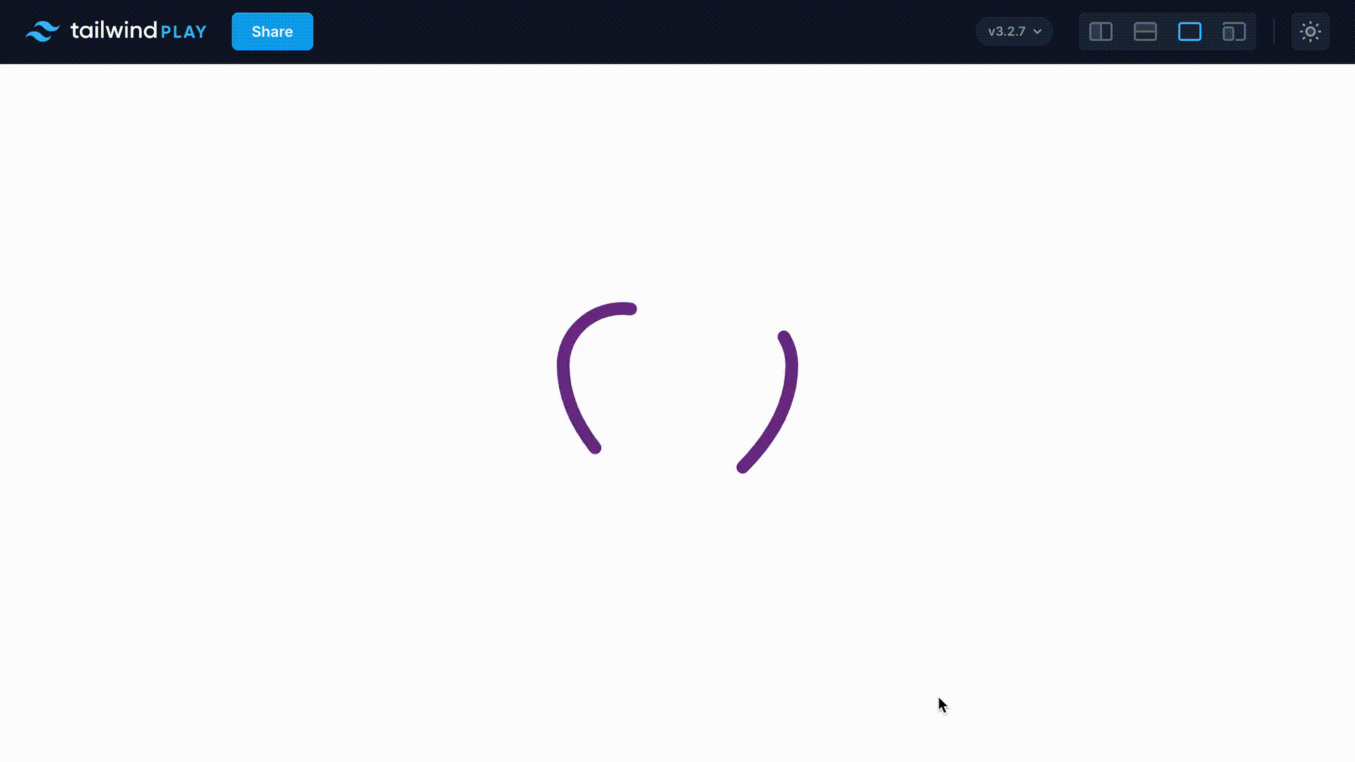
Visit the Tailwind Playground website. The playground looks like the image below

2. Highlight and delete all the code found in the HTML tab. It creates space for where we are going to write our code.
3. Paste the following HTML code into the editor. We shall use the same SVG used for the CSS line animation. The stroke and stroke-width will remain unchanged.
<div>
      <svg
        xmlns="http://www.w3.org/2000/svg"
        fill="none"
        viewBox="0 0 24 24"
        stroke-width="1"
        stroke="rebeccapurple"
        class="w-6 h-6"
        >
        <path
          stroke-linecap="round"
          stroke-linejoin="round"
          d="M21 8.25c0-2.485-2.099-4.5-4.688-4.5-1.935 0-3.597 1.126-4.312 2.733-.715-1.607-2.377-2.733-4.313-2.733C5.1 3.75 3 5.765 3 8.25c0 7.22 9 12 9 12s9-4.78 9-12z"
        />Let's center our SVG in the middle of the page by giving its container the below classes.

      </svg>
 </div>
4. Let’s center our SVG in the middle of the page by giving its container the below classes.
<div class="h-screen flex justify-center items-center">
    <svg>...</svg>
</div>
Your code and SVG should now look like the image below.

Yes, yes, I know. Our SVG is tiny and quite strains the eyes to view. But don’t worry, let’s fix that by changing the width and height.
- Go to the class attribute and change both the height and width to 72.

Looking much better now! Let’s now start creating our animation.
- Give the path SVG element the stroke-dasharray property that will define the length of the dashes. We will add it using custom CSS in the CSS tab since Tailwind hasn’t added support for this property.
@tailwind base;
@tailwind components;
@tailwind utilities;

@layer base {
  path {
    stroke-dasharray: 15;
  }
}- Add an animation to the path element (but this won’t start any animation yet!)
<path
   class="animate-[move_35s_linear_infinite]"
   stroke-linecap="round"
   stroke-linejoin="round"
   d="M21 8.25c0-2.485-2.099-4.5-4.688-4.5-1.935 0-3.597 1.126-4.312 2.733-.715-1.607-2.377-2.733-4.313-2.733C5.1 3.75 3 5.765 3 8.25c0 7.22 9 12 9 12s9-4.78 9-12z"
/>
Here is what is happening with the previous code:
- We have added an animation to the path SVG element using arbitrary values. Arbitrary values allow us to use Tailwind’s bracket notation to declare values not provided by Tailwind’s classes and which we only need to use once, without necessarily setting them up in the config file. You can read more on Tailwind’s arbitrary values here.
- The animation’s name is move, with a duration of 35s, progressing linearly and running infinitely.

Our SVG currently looks like the image above.
- Now, there is only one thing left to do for our animation to run, setting it up in the config tab. Let’s do that.
/** @type {import('tailwindcss').Config} */
module.exports = {
  theme: {
    extend: {
      keyframes: {
        move: {
          to: {
            strokeDashoffset: '1000'
          },
        },
      },
      },
    },
   }
Tada! Here is our animation in Tailwind CSS

You can take this to the next level by defining any transitions and transformations on the stroke. Let’s say we want the stroke to change to red as the animation progresses. We can add that to our move animation in the config tab.
Let’s do it!
/** @type {import('tailwindcss').Config} */
module.exports = {
  theme: {
    extend: {
      keyframes: {
        move: {
          to: {
            strokeDashoffset: '1000',
            stroke: red
          },
        },
      },
      },
    },
  }
We can also reduce the animation duration time from 35s to 10s so that the transition happens much faster, and also reduce the stroke-dashoffset to 700.
Result
Looks awesome!
Here is the link to the animation in the playground. You are free to check it, tweak it, and practice your skills on it.
I encourage you to create more animations to sharpen your skills. With that said, here is another example I created on CodePen for you to practice.
Why use Tailwind CSS over CSS?
You may prefer Tailwind CSS to CSS for creating SVG animations for several reasons. Let’s take a look at them below.
1. Responsiveness
Tailwind CSS was designed with responsiveness in mind with classes such as sm, md, and lg making it easier to make SVG animations responsive on various screen devices, thus improving the overall responsiveness of the site.
2. Cross-browser compatibility
Unlike CSS, Tailwind CSS is tested for compatibility on all the latest versions of major browsers, such as Firefox, Chrome, Safari, and Edge. This ensures that your SVG animations will render as intended without breaking changes, and the site users will enjoy a better user experience.
3. Consistency
Tailwind CSS provides reusable classes that you can use to provide uniformity to all your SVG animations thus ensuring consistency across the site.
4. Faster Development
The framework offers pre-built styles, components, and icons that speed up the development process and allows you to create SVG animations quicker than you would with CSS by writing all the code from scratch, which saves time.
5. Code optimization
By combining minification and data compression, Tailwind CSS produces much lighter CSS files ready for production than CSS. This makes the performance and loading time of your site significantly better.
6. Community support
Tailwind CSS has a large and active community that provides continuous support and development, bug fixes, and other updates. The framework has more than 7,000 questions on Stack Overflow.
Use cases of SVG Animations in web development and design
So far, we have seen what SVG animations are and how to create one. Let’s now look at their use cases: the areas in web development to use them.
- Call-To-Action Button Animations: these are one of the most common use cases of SVG Animations. Their use is more appropriate on social interaction buttons on platforms such as Twitter, Instagram, and Facebook.
- Loading Animations: SVG Animations are used to create interactive loading animations that engage users while they wait for a page or resource to load.
- Prompts: prompts are another common use case. An example of this is on blog articles, where after reading, you see a question or popup like “Have you found this useful?” or “How likely are you to recommend this article to your friends?”
- Logos: SVG animations can also be incorporated into logos to make them engaging and capture the website visitors’ attention. Mailchimp‘s logo is one example of this. When you hover over the SVG logo, the head of the chimp nods and winks.
There are many other use cases and real-world examples of SVG animations. The ones mentioned above are only the tip of the iceberg.
Conclusion
You have learned how to create SVG animations using Tailwind CSS and how to make them using CSS. In addition, you have learned about their many use cases in web development.
As Tailwind CSS adds more support and functionality for more CSS properties, its use in creating SVG animations will grow.
Thanks for reading.
Happy learning. Happy coding!

It’s really pentastic
I am glad you find it pentastic, Narendra!
Had to google the word by the way 🙂
Step 3 of the Tailwind CSS method has a line of text that shouldn’t be there: “Let’s center our SVG in the middle of the page by giving its container the below classes.”
In the Tailwind CSS part, you omitted the single-quotation marks from the color in the config code. It should be -stroke: ‘red’-, rather than -stroke: red-.