The continuously changing world of frontend frameworks often results in projects developed with a diverse array of libraries and frameworks. Such diversity can lead to inconsistencies in user experience across different applications and even within a single application.
During an assignment for one of my clients, we grappled with inconsistencies in user experience and issues with scalability. Designing cohesive themes for white-label partners proved especially challenging, given the intricacies stemming from the use of multiple UI libraries and frameworks across products.
To mitigate these challenges, we opted for a design system. Instead of starting afresh, we looked for a more streamlined method.
But, before we dive deep into the construction of our design system, it’s essential to comprehend what a design system is and its importance.
To quote the legendary Steve Jobs:
Design is not just what it looks like and feels like. Design is how it works!
Steve Jobs
This statement accentuates the importance of design beyond mere aesthetics—it emphasizes functionality. It champions the creation of intuitive user interfaces that empower users to engage without intensive training.
Steve Jobs held a deep conviction that design sits at the heart of any product. He invested considerable resources and energy into achieving unparalleled designs for Apple’s offerings. Interacting with Apple products instills trust and confidence in users, often swaying them to commit, even at a premium.
Such is the profound influence of impeccable design.
Though we generally prioritize backend architecture—databases, services, interactions—we sometimes neglect the frontend architecture and the design system when crafting the user interface. This oversight can complicate scalability in the long run.
Hence, laying the foundation of a robust design system is imperative before diving into UI development.
Let’s delve deeper into the concept of a Design System.
Understanding the Design System
Did you ever play with Legos during your younger years? If so, you’d recall the joy of crafting varied structures and personalizing them to your liking.
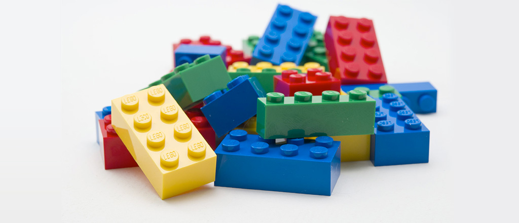
Just as Legos provide the foundational building blocks for imaginative structures, a Design System offers the fundamental components for constructing your applications.
Technically speaking, a Design System can be described as:
A collection of reusable components, steered by lucid standards and design patterns. These can be cohesively combined to curate a consistent, visually pleasing, modern design that enhances the user experience.
This system enables businesses to set their mobile and web applications apart from the competition while preserving a unified visual aesthetic across products. It establishes a shared language among developers, designers, and stakeholders, fostering the creation of uniform user interfaces without squandering vast amounts of energy and time.
Key Constituents of the Design System
A design system typically encompasses three main components:
1. Design Language
This serves as a guideline for the development of multiple products within a brand. Essentially, it’s the blueprint for applications aiming to offer a consistent user experience under the brand umbrella. This includes:
- Colors
- Typography (e.g., size, line spacing, typefaces)
- Spacing (including margins, padding, positioning, border-spacing)
- Imagery
- Motion dynamics
- Audio cues
The choice of color is foundational to design. For instance, while vibrant colors might be apt for food-related products, the hue ‘blue’ — often linked with trust and loyalty — is a favorite among social media platforms like Twitter and Facebook. Similarly, typography can significantly influence information hierarchy.Consider the design elements of a simple button. Typically, it might have a background color, specific typography for its label, internal spacing, and perhaps an accompanying icon. Interactions like hovering or clicking could initiate animations.
2. Component Library
This is essentially a warehouse of reusable components that serve as the core building blocks of your application. Depending on the technical prowess of your developers, various technologies like React, Vue, Angular, or Vanilla JS might be employed. When creating a component library, ensure it’s:
- Responsive
- Customizable
- Accessible
- User-friendly
Established libraries, such as Material UI or React Bootstrap, might be a feasible alternative if constructing a component library from scratch isn’t on the cards.
3. Style Guide
Think of this as the user manual for both the design language and the component library. It houses all the essential information a designer or developer might need to kickstart their journey with the system — amalgamating guidelines and installation protocols in one accessible location.
Crafting a Design System: Who Should Be on Board?
Constructing an effective Design System is a collaborative venture. Your team should ideally include:
- Designers for visual aesthetics
- Developers for modular and efficient code
- Product managers to ensure alignment with customer needs
- Accessibility experts to ensure the platform caters to diverse user needs
Why Adopt a Design System? Advantages Unraveled
- Scalability: As teams expand, ensuring design and developmental consistency becomes a challenge. A design system acts as the unifying reference, ensuring teams remain in sync, thus promoting business growth.
- Design Consistency: Leveraging standard components and guidelines ensures uniform UI across diverse products, fortifying brand identity and elevating user experience.
- Faster Development: Harnessing pre-existing components within a design system minimizes the need for building from scratch, channeling focus on the core product for quicker, quality deliverables.
- Accessibility: Design systems advocate for inclusivity, catering to individuals with disabilities, those on slow internet, or using older tech. It’s not just about boosting revenue; it’s about building a morally sound platform.
Incorporating a Design System isn’t just a trend; it’s a paradigm shift towards improved efficiency, design consistency, and enhanced user experience.
Exploring Methodologies of the Design System
Design systems can be formulated using various methodologies. Let’s delve into a couple of prominent approaches.
1. Atomic Design
Atomic design involves deconstructing the entire interface into its most basic units and then building upon them. Google’s Material design is a notable example that utilizes the atomic design methodology.In his book “Atomic Design,” Brad Frost elaborates on how to craft a design system based on the atomic paradigm.
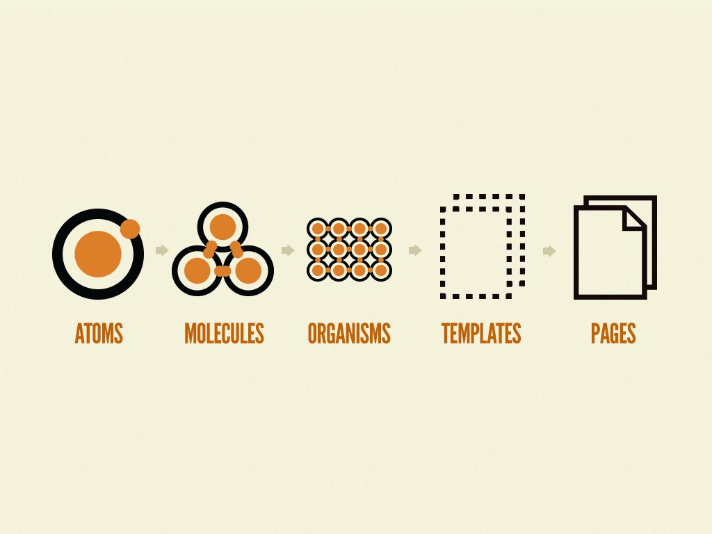
This methodology breaks down design into five distinct levels. Here’s a closer look:
- Atoms: These represent the fundamental building blocks of the design system. Elements such as HTML tags, form inputs, labels, and buttons fall under this category.
- Molecules: Comprising groups of atoms, molecules are the rudimentary combinations that create compounds. A few examples include a search box, navigation menu, or login form.
- Organisms: These are clusters of molecules, either similar or diverse, which can function autonomously. A header containing a logo, search box, and a login button is an example.
- Templates: Predominantly, templates are configurations of organisms assembled to create page layouts. It’s at this level that clients begin to witness the preliminary design in context.
- Pages: These represent specific instances of templates infused with tangible data. It’s the juncture where the design system’s efficacy is put to the test.
2. Non-Atomic Design
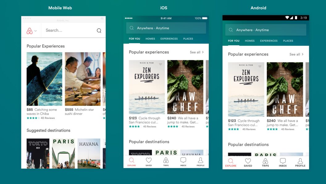
While many organizations favor the atomic design methodology, others adopt alternative strategies. IBM’s Carbon design system and Airbnb’s Design Language System (DLS) exemplify this non-atomic approach.Rather than fixating on individual atoms as in the atomic design, Airbnb’s system perceives components as facets of a living entity. These components possess unique functionalities and characteristics. Defined by certain attributes, they can coexist harmoniously and evolve—or sometimes become obsolete—on their own. Every component is delineated by its essential features (like title, text, icon, and image) and, on occasion, by optional ones as well.
Building a Design System Using Material Design
Many organizations craft their own design systems to maintain full control over customization. However, some, due to constraints in resources and time, prefer adopting open-source design systems, tailoring them to their needs.
Now, let’s explore the implementation of a client’s design system.
This design system was constructed on top Material Design, employing MUI as the primary component library.
Common Color Palette
export const colors = {
  BKGD_DEFAULT: 'rgba(250, 250, 250, 1)',
  TEXT_PRIMARY: 'rgba(0, 0, 0, 0.84)',
  ...
}

export const commonPalette = {
  background: {
    default: colors.BKGD_DEFAULT,
  },
  text: {
    primary: colors.TEXT_PRIMARY,
    secondary: colors.TEXT_SECONDARY,
    disabled: colors.TEXT_DISABLED,
  },
  primary: {
    main: colors.PRIMARY_MAIN,
    light: colors.PRIMARY_LIGHT,
    dark: colors.PRIMARY_DARK,
  },
  secondary: {
    main: colors.SECONDARY_MAIN,
    light: colors.SECONDARY_LIGHT,
    dark: colors.SECONDARY_DARK,
  },
  error: {
    main: colors.ERROR_MAIN,
    light: colors.ERROR_LIGHT,
    dark: colors.ERROR_DARK,
  }
  ..
}
The color palette for theme1
export const palette = deepmerge(
  commonPalette,
  {
    primary: {
      main: 'rgb(44 75 89)',
      light: 'rgba(39, 62, 72, 1)',
      dark: 'rgb(41 69 82)',
    },
    secondary: {
      main: 'rgb(252 183 94)',
      light: 'rgb(252 207 150)',
      dark: 'rgb(225 151 57)',
    },
  },
);
Customizing MUI Button component in the design system
import { Theme } from '@mui/material/styles';

export const MuiButton = (theme: Theme) => ({
  defaultProps: {
    variant: 'contained',
  },
  styleOverrides: {
    root: {
      boxShadow: 'none',
      lineHeight: theme.spacing(1.5),
      borderRadius: theme.spacing(0.62),
    }
  }
});
Using the design system
import { ThemeProvider } from '@mui/material/styles';
import CssBaseline from '@mui/material/CssBaseline';
import { theme1 } from 'design-system';
import App from './App';
return(
<ThemeProvider theme={theme1}>
<CssBaseline />
<App />
</ThemeProvider>
)
//App.jsx
import { Box, Button } from '@mui/material';
export default function App() {
return (
<Box>
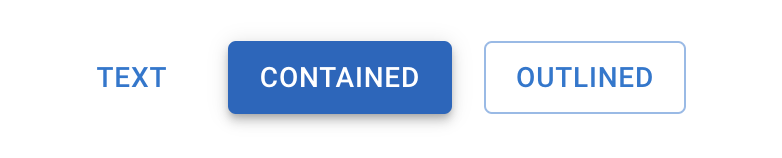
<Button variant='text'>Text</Button>
<Button variant='contained'>Contained</Button>
<Button variant='outlined'>Outlined</Button>
<Button variant='contained' color='secondary'>
Secondary
</Button>
<!-- Customizing individual component -->
<Button
variant="outlined"
sx={{ borderRadius: 1.25 }}
>Custom</Button>
</Box>
);
}
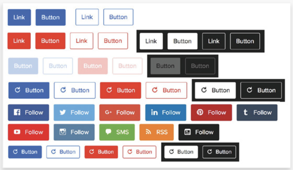
Buttons in our design system:
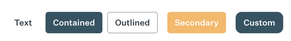
The integration of this design system was pivotal in refining the client’s user experience and bolstering user engagement. By harnessing the versatile design system with multifaceted themes, developers effortlessly embedded consistent design elements, such as color, typography, and spacing, circumventing the need for manual adjustments.
Consequently, the client streamlined the delivery process for white-label partners, trimming down the implementation duration. The accessibility of ready-made components within the MUI framework boosted this efficiency. Developers could capitalize on these without initiating every element from ground zero. The streamlined CSS writing process further propelled the development pace, marking a significant 30-40% upswing.
Up to this point, our discussion has primarily centered on design systems. Now, let’s pivot to scenarios where a design system might not be the best fit.
When Not to Opt for a Design System?
A design system might be superfluous if the project is of a smaller scale and doesn’t foresee extensive development. Nonetheless, adhering to some foundational design principles is invariably advantageous.
For a design system to be worthwhile, there should be an overarching project that will leverage it. Otherwise, its creation might be futile.
Conclusion
Should you find teams recurrently constructing identical components or facing scalability challenges, it could be a cue to initiate a structured design strategy. A design system bridges the gap between engineering and design factions, facilitating the streamlined creation of a harmonious user experience that can effortlessly extend across a myriad of products and platforms.
A design system transcends the mere assembly of a component library. It envelops comprehensive research, meticulous upkeep, and the adept distribution of documentation detailing the organization’s design benchmarks and norms.
Nathan Curtis eloquently captures the essence:
A design system is not a project or a side project. It is a product serving other products.
Nathan Curtis
To cement its successful integration within a corporate framework, it’s vital to esteem the design system as a prized asset. Overlooking this can stymie its assimilation and truncate its overall potential.

Really great article to understand the design system