Material UI framework is an open-source user interface framework for React that follows the principles of Google’s Material Design. It offers a variety of components allowing developers to create appealing and user-friendly interfaces, without starting from scratch.
Material Design prioritizes a consistent user interface with attention given to elements like light, shadow, and motion effects.
To make our application more visually appealing we will learn how to code a Dark Mode feature for our application.
Overview
We can combine the Material UI framework with React to create a Dark Mode of our web applications. This tutorial will guide you through the steps of adding Dark Mode to a React application using Material UI.
Dark Mode, also known as night mode or darkness theme refers to an option in the user interface design where the content, on the screen is presented in colors compared to the illumination mode. When you activate the mode the background color typically appears as black or dark while the text and user interface elements are displayed in colors that create a striking contrast, between the foreground and background.
Let’s now find out how to add Dark mode in React using Material UI (MUI).
Setting up a React Project
To begin with, we need to set up a React project first. Here’s how you can get started:
Prerequisites
Please make sure you have Node.js and npm (node package manager) installed on your system before we start to implement Dark Mode.
Installation of required dependencies
To install Node.js, visit the Node.js site, and download the current version of it according to your operating system. After that just follow the installation steps to complete the process.
Once the Node.js is installed, check whether the node.js version is properly installed by running the given command in your command line terminal:
node –versionIf the Node is installed correctly, we can proceed further to add the dark mode functionality in React using MUI.
Creating a new React project
We typically create the react app using the traditional method i.e., using Create React App (CRA), but it can take a lot of time to install the required dependencies.
Vite – a new frontend tool that saves the time in creating a react application. So, now instead of using CRA, we are going to use Vite:
Run the following command in your terminal to start working with Vite:
npm create vite@latestFollow the prompts to enter your project name, framework, and a variant:
Need to install the following packages:
  create-vite@4.4.1
Ok to proceed? (y) y

✔ Project name: ... my-react-project
✔ Select a framework: » React
✔ Select a variant: » JavaScript
Next, navigate to your project directory using the following command:
cd my-react-projectThen, use the npm command to install the dependencies:
npm installConfiguring Material UI in the project
To integrate Material UI into your React app, you need to install the Material UI core package and its styles. These come in three packages:
npm install @mui/material @emotion/react @emotion/styledStart the development server
Now, we will start our development server to test whether everything is properly implemented and is working.
Run the following command:
npm run devYou will see the following output:
VITE v4.4.9  ready in 943 ms

  ➜  Local:   http://127.0.0.1:5173/
  ➜  Network: use --host to expose
  ➜  press h to show help
To see the output, visit http://127.0.0.1:5173/ where the default react project is running:
Implement Dark Mode using Material UI in ReactJS
Adding the dark mode feature in a React application involves instatiating a ThemeProvider to handle dark and light themes and adding a switch to change between modes.
Enabling Dark Mode using Material UI’s ThemeProvider component
The Material UI provides a theme provider component called ThemeProvider that will allow themes to be defined and used in the app. The ThemeProvider tool allows for a dynamic switch from light to dark themes when implementing the Dark mode. You may create two separate themes when using a Dark mode, one for Light Mode and the other for Dark Mode.
In this case, you can use the ThemeProvider service to place components of your application into a package and switch among these themes according to user preferences or special events.
To enable the dark mode, we need to create a darkTheme function using the createTheme utility.
For applying the dark theme to entire application, we will wrap all our main content into the ThemeProvider component, ensuring that all components within it follow the defined theme, creating a consistent and visually appealing user interface.
Now go to the src/App.js file in your project and replace the existing code of the file with the following example:
// App.js
import React, { useState } from "react";

import { ThemeProvider, createTheme } from "@mui/material/styles";
import CssBaseline from "@mui/material/CssBaseline";

export default function App() {

  // create a darkTheme function to handle dark theme using createTheme
  const darkTheme = createTheme({
    palette: {
      mode: darkMode ? 'dark' : 'light',
    },
  });

  return (
    <ThemeProvider theme={darkTheme}>
      <CssBaseline />
	// other code goes here…
    </ThemeProvider>
  )
}
In the above code, apart from using just the ThemeProvider, we also use the <CssBaseline> to use the full set of Global CSS Styles in your applications. The inclusion of <CssBaseline> is required for ensuring coherent image experience in both light as well as darkness modes when implementing this mode.
Once, you are done with the above step, you can now create a separate dark theme with different colors.
Creating a separate dark theme
To customize the dark theme for multiple components in the application, you can modify it by defining the primary, and secondary colors and other properties.
Replace the existing palette colors with the following example code in the App.js after the imports and before export default function App().
//App.js

export default function App() {

// applying the primary and secondary theme colors
const darkTheme = createTheme({
  palette: {
    mode: 'dark', //default theme
    primary: {
      main: '#90caf9',
    },
    secondary: {
      main: '#f48fb1',
    },
   // add other properties here…
  },
});

  ...

  return(
    ...
  )

}
With the complete ThemeProvider setup, your entire app will now use the dark theme by default. But what if we want to toggle between light and dark themes? We will do it next.
Toggling Dark Mode
To give your users a way to toggle between different theme modes, you can add React’s context to a button’s onChange event, as shown in the following demo.
Creating a switch or button to toggle between light and dark mode
To toggle between the light and dark modes in a React app, we need to add a switch button to it. Adding a switch can be done by importing the Switch Component from Material UI and then defining it in the App component.
For defining a switch, we can simply add the new <Switch> component between the ThemeProvider tags. We’re going to add a div, a card with example content and the switch to change the theme:
//App.js

export default function App() {

  // applying the primary and secondary theme colors
  const darkTheme = createTheme({
    ...
  });

  return (
    <ThemeProvider theme={darkTheme}>
      <CssBaseline />
      <div style={{ display: 'flex', flexDirection: 'column', alignItems: 'center' }}>

        //Adding the switch button
        <Switch checked={darkMode} onChange={toggleSwitchFunction} />
         ...
      </div>
    </ThemeProvider>
  )
}
Once you have added the Switch button, let’s define the toggle states so that the switch can toggle the dark or light theme. Below is how we can define the states using the useState() hook in React.
//App.js

export default function App() {

  // state to manage the dark mode
  const [toggleDarkMode, setToggleDarkMode] = useState(true);

  // function to toggle the dark mode as true or false
  const toggleDarkTheme = () => {
    setToggleDarkMode(!toggleDarkMode);
  };

  // applying the primary and secondary theme colors
  const darkTheme = createTheme({
    ...
  });

  return (
    <ThemeProvider theme={darkTheme}>
      <CssBaseline />
      <div style={{ display: 'flex', flexDirection: 'column', alignItems: 'center' }}>
        <h2>Toggle Dark mode</h2>
        <Switch checked={toggleDarkMode} onChange={toggleDarkTheme} />
         ...
      </div>
    </ThemeProvider>
  )
}
Here, we have first imported all the required components from React and MUI, after which inside the main App component, we have initialized a state variable toggleDarkMode where the initial value is set to true, indicating the dark theme is currently active. With the variable, we have also defined a function to update the state called setToggleDarkMode.
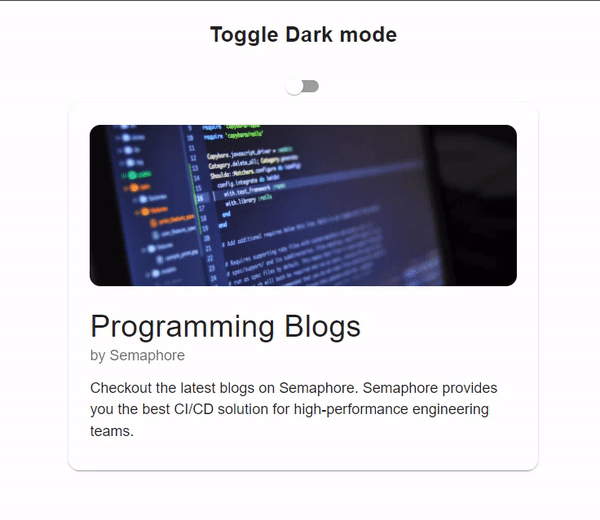
Finally, we will add our card example to switch the theme and if you have followed all the steps correctly your App.js should look like this:
//App.js file

import { ThemeProvider, createTheme } from "@mui/material/styles";
import CssBaseline from "@mui/material/CssBaseline";
import { Card, CardContent, CardMedia, Switch, Typography } from "@mui/material"

export default function App() {

  // state to manage the dark mode
  const [toggleDarkMode, setToggleDarkMode] = useState(true);

  // function to toggle the dark mode as true or false
  const toggleDarkTheme = () => {
    setToggleDarkMode(!toggleDarkMode);
  };

  // applying the primary and secondary theme colors
  const darkTheme = createTheme({
    palette: {
      mode: 'light',
      primary: {
        main: '#90caf9',
      },
      secondary: {
        main: '#131052',
      },
    },
  });

  return (
    <ThemeProvider theme={darkTheme}>
      <CssBaseline />
      <div style={{ display: 'flex', flexDirection: 'column', alignItems: 'center' }}>
        <h2>Toggle Dark mode</h2>
        <Switch checked={toggleDarkMode} onChange={toggleDarkTheme} />
        <Card sx={{ width: '30%', borderRadius: 3, padding: 1 }}>
          <CardContent>
            <CardMedia sx={{ height: 180, borderRadius: 3 }} image="https://images.pexels.com/photos/546819/pexels-photo-546819.jpeg" title="semaphore" />
            <Typography variant="h4" component="div" sx={{ marginTop: 3 }}>
              Programming Blogs
            </Typography>
            <Typography sx={{ mb: 1.5 }} color="text.secondary">
              by Semaphore
            </Typography>
            <Typography variant="body1">
              Checkout the latest blogs on Semaphore. Semaphore provides you the best CI/CD solution
              for high-performance engineering teams.
            </Typography>
          </CardContent>
        </Card>
      </div>
    </ThemeProvider>
  )
}
When you run the above code, you will notice that the toggle doesn’t change the theme to dark or light, as we haven’t added the state to update the theme dynamically, it will display a light theme by default.
Next, we will see how we can handle the state of the dark mode toggle and update it dynamically by toggling the switch button based on the dark mode state.
Handling the state of the Dark Mode toggle, updating the theme dynamically based on the Dark Mode state
You noticed that when we switch on the button, it doesn’t change the theme, it is because the state is not being handled to update the theme dynamically. We now see how we can update the theme dynamically based on the dark mode state.
To switch the theme dynamically, we are going to render a conditional condition in the darkTheme mode within our App.js file as given below:
const darkTheme = createTheme({
  palette: {
    mode: toggleDarkMode ? 'dark' : 'light',
    ...
  },
});
Finally, If you have followed all the steps correctly, your App.js will finally look like this:
//App.js

import React, { useState } from "react";
import { ThemeProvider, createTheme } from "@mui/material/styles";
import CssBaseline from "@mui/material/CssBaseline";
import { Card, CardContent, CardMedia, Switch, Typography } from "@mui/material"

export default function App() {

  // state to manage the dark mode
  const [toggleDarkMode, setToggleDarkMode] = useState(true);

  // function to toggle the dark mode as true or false
  const toggleDarkTheme = () => {
    setToggleDarkMode(!toggleDarkMode);
  };

  // applying the primary and secondary theme colors
  const darkTheme = createTheme({
    palette: {
      mode: toggleDarkMode ? 'dark' : 'light', // handle the dark mode state on toggle
      primary: {
        main: '#90caf9',
      },
      secondary: {
        main: '#131052',

      },
    },
  });

  return (
    <ThemeProvider theme={darkTheme}>
      <CssBaseline />
      <div style={{ display: 'flex', flexDirection: 'column', alignItems: 'center' }}>
        <h2>Toggle Dark mode</h2>
        <Switch checked={toggleDarkMode} onChange={toggleDarkTheme} />
        {/* rendering the card component with card content */}
        <Card sx={{ width: '30%', borderRadius: 3, padding: 1 }}>
          <CardContent>
            <CardMedia sx={{ height: 180, borderRadius: 3 }} image="https://images.pexels.com/photos/546819/pexels-photo-546819.jpeg" title="semaphore" />
            <Typography variant="h4" component="div" sx={{ marginTop: 3 }}>
              Programming Blogs
            </Typography>
            <Typography sx={{ mb: 1.5 }} color="text.secondary">
              by Semaphore
            </Typography>
            <Typography variant="body1">
              Checkout the latest blogs on Semaphore. Semaphore provides you the best CI/CD solution
              for high-performance engineering teams.
            </Typography>
          </CardContent>
        </Card>
      </div>
    </ThemeProvider>
  )
}
In the given code, we have used conditional rendering in the palette mode to dynamically update the dark mode theme in React. We have assigned the value of toggleDarkMode ? 'dark' : 'light' to the mode property which indicates that when toggleDarkMode is true, the theme’s mode is set to ‘dark’, else it will be set to ‘light’.
Run the application
Now, we have successfully learned how we can add the dark mode functionality in React using Material UI, let’s see the output of the above program.
To run the application of react, in your terminal run the below command:
npm run startGo to localhost:port, and see the output. The output of the given code will look like:
That’s all folks! Now, you have successfully learned the complete process to add dark mode in React using Material UI.
Conclusion
In this tutorial, you’ve gained an understanding of how to add dark mode into React using Material UI. By integrating a dark theme you can enhance the user experience by providing an appealing and eye-friendly alternative theme.
The step-by-step instructions outlined in the tutorial make it easy for you to seamlessly set up and switch between light modes giving your users a comfortable and aesthetically pleasing interface. With React and Material UI, at your disposal implementing a user-friendly dark mode feature becomes a gratifying endeavor.

This is the best and most detailed article on adding dark theme I’ve ever read. It is well explained and easy to read. Thanks Tarun for publishing this article.
Best tutorial, well written! Excited to see more articles on frontend development in future by semaphore.
The interactive coding exercises and real-world projects have given me a solid foundation in Java programming, and I feel much more confident in my coding skills now.
Thanks for the guide!
How can you create a different palette for the different mode?
Do you there a good example of a fully fleshed out dark vs light theme?
I like the example of how to implement switching between themes and it is very helpful but I’m also super interested in an example of an application that has two fully implemented themes (light and dark). For example how would you semantically name palette properties so that regardless of mode they colors can be used easily. Primary, Secondary, Error, Disabled, Text etc are good semantic names for things that can have color styles, but I always wonder how to pull this off with a complex app. Regardless, thanks!