At the forefront of this current era of civilization, lies the charge of inclusivity. We are fighting for each person to be seen, heard, and acknowledged. Striving to create an environment where everyone’s needs are accorded the same attention and respect. At the core of this article lies that very heartbeat. The goal is to bring to the attention of designers and developers, the necessity of designing and building beyond aesthetics. As the ones in charge of exploring the world of the internet, it’s really important that we start thinking about building websites that work for everyone. We don’t want to wait until we’ve built huge things that are hard to change. Instead, let’s start by thinking about how to make things that meet everyone’s needs right from the beginning.
We might think we’ve done a fantastic job with the fancy tools and designs we see on the internet, but did you know that 96.8% of homepages don’t meet the Web Content Accessibility Guidelines 2 (WCAG 2) standards? And here’s another shocking fact: 90% of websites can’t be accessed by people with disabilities who use assistive technology Cudd, 2023.
We’re not talking about a small group of people when we discuss individuals with disabilities. In fact, about 16% of the world’s population, which is roughly 1.3 billion people, live with a disability. That’s about 1 in every 6 people World Health Organization: WHO, 2023. Out of the 1.3 billion people, 62% of adults living with disabilities, own a laptop or desktop computer. In comparison, 81% of adults without disabilities own a laptop or desktop computer. Furthermore, 72% of adults with disabilities own and use a smartphone. (Cudd, 2023).
These numbers show how many people we are leaving out as we keep going in our current direction, where we focus more on how things look rather than how easy they are to use and creating a fantastic experience for everyone.
Beyond Legal Boundaries
If the previous numbers don’t make you feel empathetic about inclusive design, think about it this way: you could lose a lot of money.
Besides missing out on potential revenue from a market of 1.6 billion people, there are other costs to consider. In 2020, only in the United States, there were 2,500 lawsuits filed in federal court against websites that were inaccessible to people with disabilities. These lawsuits claimed violations of Title III of the Americans with Disabilities Act (ADA), which prevents businesses open to the public from discriminating against people with disabilities. Furthermore, in 2021, in violation of the same act, 11400 cases were filed. (Gonzales, 2022).
Even if you manage to win the legal battle, the expenses for hiring lawyers, going through court processes, and the damage to your reputation can lead to a huge financial burden. It’s not just about money; it’s also about how people perceive your company, and this can have long-lasting effects on your company’s success for years to come.
Outcomes from Inclusive-Driven Design
- Improved Accessibility: Design inclusivity ensures that products and services are accessible to a wider audience, including individuals with disabilities.
- Enhanced User Experience: Inclusive design leads to the creation of a shared better user experience. Features such as larger text, easy-to-use menus, and clear design layouts can benefit not only individuals with disabilities but also the general population. For example, captions in videos benefit users with hearing impairments, but they also help those in noisy environments or those who prefer silent video viewing.
- Increased Market Potential: When you think about a wider range of users, you can reach new groups of customers. Remember, there are 1.3 billion people with disabilities who are an untapped market because many designs aren’t inclusive.
- Legal and Ethical Compliance: Design inclusivity helps you as an organization to comply with legal requirements related to accessibility and discrimination. Laws like the ADA and WCAG set the standard for inclusivity, with failure to meet these standards risking legal issues and reputational damage.
- Positive Reputation: Companies that care about inclusivity look good to the public. When you include everyone in your designs, it shows that you care about social responsibility and diversity.
- Innovation and Creativity: Inclusivity challenges designers and developers to think creatively and come up with innovative and out-of-the-box solutions to meet the diverse needs of users. This leads to the development of futuristic products and services that set the company apart from its competitors.
- Social Cohesion: Inclusivity helps create a fairer society, where people from all backgrounds and abilities can take part in different aspects of life.
What is Inclusive Design?
Before we dive deeper into the world of design inclusivity, let’s establish a clear definition. Design inclusivity refers to the practice of crafting products, services, environments, and experiences while considering and accommodating the needs of a diverse range of users.
Mind-Driven Designing vs Heart Driven Designing:
Mind-driven design versus heart-driven design pits compliance against inclusivity. It has become a quite common occurrence for most current designers to design only with fulfilling compliance as the focus. It is assumed that fulfilling compliance, to some extent, covers inclusivity. This assumption is not entirely false, neither is it entirely true.
Compliance and inclusivity, while sharing some similarities, represent two distinct approaches to addressing diversity and accessibility in design practices. Compliance involves adhering to the set regulations and standards, often focused on meeting the basic requirements. While this approach ensures a baseline level of accessibility and non-discrimination, it also creates a “check-the-box” mentality, where designers and developers aim to meet the minimum requirements without going beyond to genuinely understand and embrace the totality of the diverse needs of their users. In contrast, inclusivity is a proactive way of designing that involves a human-centred approach aiming to understand and accommodate the widest range of individuals and their unique needs. It surpasses basic requirements, and legal mandates, focusing on empathy, user engagement and experience, and the creation of products, services, and environments that genuinely cater to everyone. Inclusivity goes beyond regulations, emphasizing usability that fosters innovation, enhances user experiences, and aims at creating a more equitable society.
Does this mean compliance is unimportant? No! Compliance serves as the necessary starting point, the foundation on which inclusivity can be built. Compliance should not just be viewed as a basic requirement to be met, it should be the step that ushers us into a heartfelt commitment to understanding and serving diverse user needs. We should demonstrate empathy in our design.
Empathy in design entails actively listening to and engaging with users of all backgrounds and abilities. This provides profound insights into users’ challenges and aspirations, resulting in designs that resonate deeply with users and deliver exceptional user experiences.
Furthermore, it fosters a profound connection between designers and users, resulting in solutions that empower everyone. Empathy transforms inclusive design from a compliance-driven task into a potent tool for positive social change, innovation, and true user satisfaction.
Moreover, compliance alone cannot keep up with the rapidly evolving technologies and user needs. Compliance alone will render designs outdated or inadequate shortly. Whereas, a broader commitment to inclusivity, where innovation stems from a deep understanding of user needs, will allow designers to deliver more meaningful and enduring design solutions.
Prerequisite:
Before diving in, it is recommended that you are familiar with
- Web Design (HTML, CSS, JavaScript)
- UI/UX Design (Figma)
If you’re new to these tools, it’s worth getting acquainted.
Principles Governing Inclusive Design
Our aim in this article is to delve deeply into the heart of user experience, transcending the creation of just aesthetically stunning designs. Instead, our goal is to create digital environments that prioritize and effectively cater to the needs and preferences of every user. With this, we intend to build bridges that interconnect us, rather than walls that divide us.
To achieve this feat, we will require a guiding structure. This will serve as the framework which will guide our website construction. However, genuine empathy-driven design will require consistent reiteration of your work and continuously making improvements to the design and functionality
The foundation on which this structure will rest will be the WCAG 2 guidelines and standards.
The Structure will span across the core principles that govern inclusive design, focusing on the 4 essential ones:
- Flexibility
- Adaptability
- Simplicity
- Universal Access
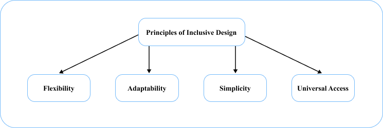
These principles, rooted in WCAG 2 guidelines will give us a more encompassing approach, allowing the needs of users of all backgrounds, abilities, and preferences to be met. As mentioned earlier, our aim is not just to meet the basic needs of the user, but to make sure that every user, shares a common great experience when using the website. This is why this structure will serve as the foundational framework
Furthermore, to make the most of the structure you should first understand your users and what you intend to achieve at the end of your work. Some questions to help you start appropriately will be:
- What problem am I trying to solve?
- What problem is the design going to solve?
- How well do I understand the product I am designing for?
- What does the brand want to communicate to their users?
- Who are the users we are targeting?
- What is the greatest demographic amongst these users?
- How easy should it be to interact with my design?
- Is the concept I am conveying easily understandable to the user?
- Is my design focused on aesthetics, functionality, or user-centered?
Flexibility: Extending Grace to meet Diverse Needs
In the first quarter of 2023, approximately 95.3% of global internet users accessed websites via smartphones. In comparison, there were 63.4% of laptop and desktop users (Ani Petrosyan, 2023). This has been a significant change over the last 30 years. Based on this, it is important that most websites are designed to be accessible across various devices, especially the smartphone. These designs should not just be desktop/laptop designs shrunk to fit smaller devices. A design should be made specifically for each screen size with common functionality with no user experience lost between devices.
This is why flexibility is a fundamental principle of inclusive design. Flexibility speaks to the creation of digital environments adaptable to a wide range of user needs and device preferences. In doing this, we should also make sure there is no loss of any key elements in user experience. This makes websites more accessible to diverse audiences, including those with disabilities. To achieve flexibility, we can refer to the WCAG 2.1, specifically Guideline 1.3 – Adaptable, which goes beyond responsive design and takes a holistic approach to user experience.
Core Components of Flexibility
- Screen Size Adaptability: Ensure that your website’s content can adapt seamlessly to various screen sizes and resolutions. This allows for users across different devices and platforms to easily access your content.
- Customization and User Preferences: Accommodate user preferences by offering customizable options such as adjustable font sizes, colour themes, and high contrast modes. This allows users select options that will better suit their experience.
<!-- This code snippet demonstrates how to create buttons that allow users to
increase or decrease the font size of a web page's content. The JavaScript
functions adjust the font size, providing adaptability for users with different
preferences. -->

<button onclick="increaseFontSize()">Increase Font Size</button>

<button onclick="decreaseFontSize()">Decrease Font Size</button>

<p id="content">This is some text with adjustable font size.</p>
// This code snippet demonstrates how to create buttons that allow users to increase or decrease the font size of a web page's content. The JavaScript functions adjust the font size, providing adaptability for users with different preferences.
function increaseFontSize() {
var content = document.getElementById("content");
var currentSize = window
.getComputedStyle(content, null)
.getPropertyValue("font-size");
var newSize = parseFloat(currentSize) * 1.2 + "px";
content.style.fontSize = newSize;
}
function decreaseFontSize() {
var content = document.getElementById("content");
var currentSize = window
.getComputedStyle(content, null)
.getPropertyValue("font-size");
var newSize = parseFloat(currentSize) / 1.2 + "px";
content.style.fontSize = newSize;
}3. Keyboard Navigation: All interactive elements on your website should be accessible and operable using the keyboard only. This guarantees that users with mobility impairments can effectively navigate your site without difficulty.
// This JavaScript code allows for keyboard navigation with arrow keys and looping within the menu.

const mainMenu = document.getElementById("mainMenu");

let currentIndex = -1;

mainMenu.addEventListener("keydown", (event) => {
  if (event.key === "ArrowDown" || event.key === "ArrowUp") {
    event.preventDefault();

    const menuItems = Array.from(mainMenu.querySelectorAll("li"));

    if (event.key === "ArrowDown") {
      currentIndex = (currentIndex + 1) % menuItems.length;
    } else {
      currentIndex = (currentIndex - 1 + menuItems.length) % menuItems.length;
    }
    menuItems[currentIndex].querySelector("a").focus();
  }
});- Accessible Forms: Design your forms with accessibility in mind. This includes providing clear labels, instructions, and error handling. Labels should be used over or alongside placeholders, to avoid the user losing the instructions once they begin to fill the form.
- Video Captions and Transcripts: Provide captions and transcripts for video elements in your design. This caters to users with hearing impairments and users who prefer to watch movies in silence. This is not tedious to do anymore, as most video players and platforms offer built–in support for captions.
User-Centered Concepts of Flexibility:
Flexibility goes beyond the WCAG 2.1 guidelines. It aims to make the experience more user-centered. To achieve flexibility, you should include concepts that enhance the user’s experience when they interact with your site. The top 4 of these concepts are:
- User-Controlled Dialog: Prioritize user-initiated dialogues. This allows users to control the flow of interactions on your website.
- Multi-threaded Tasks: Enable concurrent and combined task execution. This allows your users to perform multiple actions simultaneously with minimal interruptions and without delay.
- Efficient Task Transfer: Ensure that tasks can easily and frequently be transferred between the user and the system. This allows for quick task execution.
- Alternative Input and Output Methods: There should be various input and output methods to accommodate user preferences and needs. There should not be one way of doing things. Offer as many possible ways to achieve the same task for your users, allowing the user to choose what works best for them.
Adaptability: Designing for Everyone
Adaptability is a fundamental principle of inclusive design, ensuring that web content is accessible to all users, regardless of their abilities or preferences. At the heart of this principle lies WCAG 2.1 Guideline 1.1 – Text Alternatives, which sets the stage for creating adaptable content that caters to diverse needs. This guideline emphasizes the importance of providing comprehensive text alternatives for non-text content.
Practically speaking, to make a website adaptable based on WCAG 2.1 Guideline 1.1, consider the following checklist:
- Alt Text for Images: Ensure that all images, graphics, and icons have descriptive alt text. Alt text should convey the content and context of visual elements, aiding users who rely on screen readers WCAG 2.1 Guideline: 1.1.1 – Non-text Content
- Long Descriptions: For complex images that cannot be adequately described in the alt text, provide long descriptions or links to dedicated pages with in-depth explanations. This ensures that all users can comprehend the content fully.
- Accessible PDFs and Documents: Ensure that PDFs and other documents on the website are accessible, with text that can be read by screen readers and appropriate tagging for headings, lists, and links WCAG 2.1 Guideline: 4.1.2 – Name, Role, Value.
- Semantic HTML: Utilize semantic HTML elements to provide structure and meaning to content. This makes it easier for screen readers and assistive technologies to interpret and convey information accurately.
- Alternative Navigation Methods: Offer alternative navigation methods, such as skip navigation links, to assist users in quickly accessing content and bypassing repetitive elements WCAG 2.1 Guideline: 2.4.1 – Bypass Blocks.
- User Training and Support: Provide user guides and support materials for assistive technology users, helping them navigate and interact with your website effectively.
It is at this point that we go beyond the guidelines and reach the core of the designer. As a designer, to achieve empathy-driven design, you should also be adaptable on three fronts.
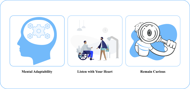
Mentally Adaptability
Consistently and intentionally evolve in your skillset when it comes to adaptability. Do not merely follow the trends, improve consistently but carefully. Go beyond artistic and visual competency, and understand the work of those in your team by studying what they do. You can be a designer and learn how to code, not to become a developer, but so that you can design in tune with them, making handing off easier. You can also acquaint yourself with software and upcoming technologies but with the user in mind. Aim at becoming better to provide better solutions to meet user needs.
Listen with Your Heart
What distinguishes us as humans from any other species or technology is our ability to empathize. Empathy is heart-oriented and not mind-oriented. Open your heart to your surroundings and be malleable enough to feel the needs of those around you. This will give you more information on how to create designs that resonate with users and make the user feel seen by you.
Remain Curious
Enjoy adversity and do not kill your curiosity. Adversity in this sense means enduring the challenges that come with completing your task. It is difficult to keep giving your all in the face of constant rejection by higher-ups. At some point, you will be tempted to just go with the basic, ignoring the urge to produce an all-around enjoyable experience for each user and focus on solely satisfying the general populace. It is in these moments, that you have to remember why you have been called into this noble fraternity. It is in these moments that your curiosity to find a level ground that is acceptable and satisfactory to all parties should be more active. Do not allow yourself to be beaten into the rigid system. Maintain the fluidity of your creativity, because your users rely on you and your ability to consistently keep them at the centre of your work.
Simplicity: Elegance and Clarity as an Art
The best designs are simple designs. It is easy to get caught chasing complexity with all the advanced design tools that are rapidly being released. The aim of your design is to meet the needs of the user and to grant the user several easy options to achieve their intended task. It becomes completely redundant if, in your quest to become sophisticated, you lose focus on who matters most – the user. Be simple in the creation of your work, aiming at providing complete satisfaction for every user.
Furthermore, simplicity as a principle of inclusive design is underpinned by WCAG 2.1 Guideline 2.4 – Navigable, which focuses on creating user interfaces that are clear, intuitive, and easy to navigate for all users. To practically implement simplicity and ensure a website’s inclusivity, it’s essential to consider specific guidelines and laws while creating a checklist for simplicity in web design:
- Consistent Page Titles: Provide consistent and descriptive page titles for each web page WCAG 2.1 Guideline: 2.4.2 – Page Titled. This ensures that users can quickly identify the content and context of a page, helping with navigation and providing clarity.
- Meaningful Headings and Labels: Use meaningful and appropriately structured headings and labels for content. Clear headings and labels improve content organization and comprehension for all users, especially those using screen readers. Design as if you are designing for a child who has no compass of complexity yet.
- Logical Focus Order: Arrange the focus order of interactive elements logically. This makes it easier for users to accurately predict the flow of navigation and interact with content more efficiently.
- Error Handling: Implement clear error messages and provide guidance on how to correct errors WCAG 2.1 Guideline: 3.3.1 – Error Identification. This simplifies the user experience and helps users, including those with cognitive disabilities, recover from errors without the urge to give up.
- Consistent Layout and Design: Maintain a consistent layout and design throughout the website WCAG 2.1 Guideline: 2.4.10 – Section Headings. Consistency in design elements such as navigation menus and buttons enhances usability and simplifies the overall user experience. This is further underscored by Jacob’s law. Users will prefer consistency and familiarity during their experience. Thus, even in your experimentation, do not wander too far off.
- Progressive Disclosure: Progressively and gradually disclose complex information to prevent overwhelming users with too much information at once. This is also in alignment with 3 laws of UX:
- Hick’s Law which states that increasing the number of choices or stimuli increases the time it takes for users to make a decision (Yablonski, n.d.). Therefore, by reducing the number of choices presented at once to the user, you allow the user to make decisions more efficiently and interact better with the design environment.
- Zeigarnik Effect which suggests that people remember uncompleted or interrupted tasks better than completed ones (Yablonski, n.d.). In the context of progressive disclosure, it is advantageous to provide information in stages, leaving users with a sense of curiosity and the desire to complete the task. This improves the user’s engagement.
- Miller’s Law which proposes that people can hold about seven (plus or minus two) pieces of information in their working memory at once (Yablonski, n.d.). Thus, presenting information in manageable chunks, ensures users can easily process and efficiently interact with the content.
Universal Access: Tumbling Down Barriers and Borders
Universal access is the bedrock of design inclusivity. With universal access, the goal is not to create a ‘one-size-fits-all’ solution, it is aimed at creating multiple solutions that address the needs of every user, without leaving anyone being left behind.
As a principle of inclusive design, it is central to ensuring that digital content is accessible to everyone, regardless of their abilities or limitations. To create a checklist for making a website universally accessible based on the WCAG 2.1 guidelines, consider the following practical steps:
- Plain Language: Use plain and straightforward language throughout the website content WCAG 2.1 Guideline: 3.1.1 – Language of Page. Avoid jargons and complex terminologies to enhance content readability for all users, including those with cognitive disabilities.
- Complex Term Definitions: When complex terms are necessary, provide clear and concise explanations or definitions. This helps users understand specialized terminology.
- Interactive Element Consistency: Maintain consistency in the design and behaviour of interactive elements, such as buttons and links. Consistency simplifies user interaction and navigation.
- Text-to-Speech Compatibility: Ensure compatibility with text-to-speech software and assistive technologies. This allows users with visual or cognitive disabilities to access and appropriately interact with content with better understanding.
- **Task Completion with Minimal Effort: **Users should be able to complete their intended task easily in multiple ways without getting tired. Elements should be within easy reach of the user and following through commands to achieve tasks should not be tedious.
- Adequate Spacing and Element Size: Make sure elements are the right size, but not large enough to crowd the space. Also allows for adequate spacing between elements, allowing for easy interaction with each element without accidentally touching others.
- Accessibility Statement: Provide an accessibility statement that outlines the website’s commitment to accessibility and offers contact information for users with accessibility concerns.
Charting the Course of a Bright Future — Inclusive Design’s Progressive Path
To achieve a better world where inclusive design is paramount, the thought of inclusivity has to ring through the entire creative process. From the level of ideation up to deployment. This means the clarion call is not only to the designers, but to developers, researchers and everyone included in the process. Even if the designer, designs with inclusivity in mind, without the vision of the designer being carried along throughout the design process, the end product will render the designer’s intention futile. Whereas the situation where each step along the way and at every level, more inclusive ideas are added until the end product is achieved, will create a more inclusive and empathy-driven design. Understand that great ideas are not in only one person’s mind and as such, a collaborative effort by all of us will yield better results than if only one faction commits to making this change.
Overcoming the Barriers and Challenges of Inclusive Design
As stated at the beginning of this article, the entire structure serves only as a guide. It is relevant to note that, to truly overcome the barriers and challenges we are faced with when it comes to inclusive design, we have to go the extra mile to find out what each user needs. How that is attained is by continuous testing. No matter the end product that is produced, it is important that you note that, it is never a completed work. Perfection and finality can only be achieved in a static world inhabited by flawless individuals. Since we live in a dynamic world with rapid advancements and progressively increasing needs to be met, the creation of a complete work will continue to be a thing of dreams and imagination.
Continually test your work with your users, take feedback seriously, and work on your end product meticulously, refining it consistently. Your work should grow with your users and their needs.
The Future of Inclusive Design
Amidst all this, we live in a fortunate era as designers. We have so many technological advancements in this era, that we can use to our advantage. One of them is AI technology. In recent times there have been so many discussions about how AI technology will render designers obsolete. That would only be true if our only purpose was to design. We are called to be problem solvers. Our work ushers people into amazing digital environments where their needs are met. We possess the unique ability to connect to our users beyond just design, to find what issues truly serve as hindrances to their web experience. Thus, we should stop considering AI technology as a competitor, rather as a partner. AI technology can be used to build the basic structures of our work, research more about our users and their struggles, and even achieve certain guideline standards such as captioning, creating better image descriptions, and automating regular testing of our website. AI can also be used to track feedback and keep logs of the most pertinent and requested adjustments required.
Automating such processes to AI technology will free up more time for you as a designer to improve your skillset and knowledge base whilst working faster to produce better products.
Conclusion
Designing should not be looked at through the bottleneck of aesthetics. When approaching design, looking at the bigger picture of functionality and usability is important. Understand that, user engagements are not driven solely by aesthetics, functionality and usability for a wide range of users are major players also. Always aim for ease of access and ease of use by a wide range of users. Design as if the user meant the whole world to you and you would not want them to miss out on everything amazing in this life. Let the user’s needs be the center of your work.
In this technology-forward world, you are the custodian of what will become the customs and norms of our society. If the world can see us collaboratively work towards achieving a more inclusive digital world, maybe the world will finally see the need to translate that into the physical world. With our work, we can import the change we seek from our digital environments to our living world.