I am excited to share with you a new navigation experience in Semaphore, a piece of design that we’ve been thinking about and working on in the past two months.
Easier on the eyes
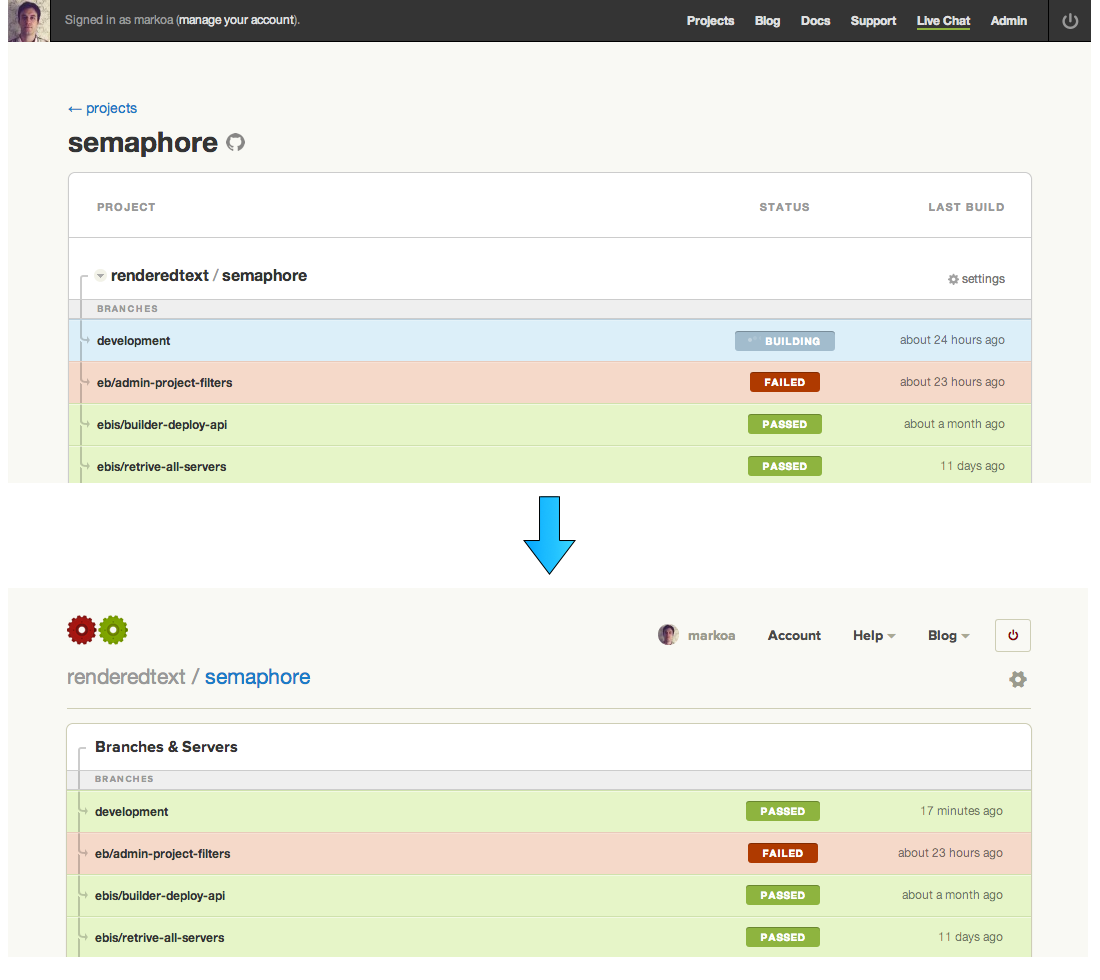
We were and still are very proud of the first version of Semaphore’s application design, but if there’s one thing we’ve grown tired of, it’s the black navigation stripe. It is replaced with a transparent row that lets you do the same things but feels much less intrusive. To go to your dashboard, click on the Semaphore cogs. The new Help menu lists in more detail all the ways you can learn more about Semaphore and get support.
Consistency to hold on to
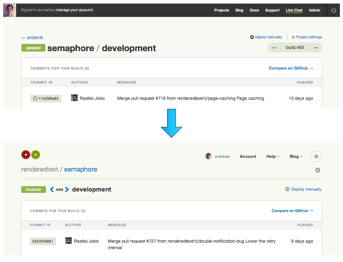
When you are using Semaphore, outside account management, the permanent scope you are in is the scope of a project. So now when you are in it, the project’s owner and linked name, along with a link to project settings, will be visible above all other elements. This has allowed us to streamline the actions and information about specific entities being displayed.
The build page is a good example. The build and branch information are grouped into a logical unit, which enabled a clear position for actions such as “Rebuild” and “Deploy manually” on the right hand side.
Less copy, more content
We have always tried to make the content be the sufficient UI, and this time we also removed some unnecessary words from the project page.
We believe that these changes are also a solid foundation for things we want to do in the future (which might even be obvious from the way UI is laid out now ;).
Hope you all enjoy!