Web development is undergoing an unprecedented surge, fueled by a cascade of new and intricate features integrated into modern web applications. In response, the web landscape itself has undergone a metamorphosis, now equipped to address many of these demands and needs right out of the box. Today, the majority of web applications boast CPU-intensive animations, intricate CSS and graphics, seamless dialogues, and user-friendly popovers. A mere few years ago, developers had to build these things from scratch consuming significant time and effort.
In this blog, we will embark on an exploration of the top five riveting modern web development features. These features will simplify building and writing code for your applications as you no longer have to build them from the ground up.
1. Native HTML Dialog
Dialogs or modals have a longstanding history of conveying supplementary information on web pages, allowing users to engage in actions seamlessly while staying within the current page’s context. This approach is highly favoured for tasks like password resets, sign-ups, and log-ins directly from the landing page. Additionally, it serves as an effective method to introduce and illustrate features how-to using graphics and GIFs.
Hassles with Building Custom Modals
Crafting a custom dialog or modal posed a significant challenge for developers. The process involved a series of steps: First, you’d need to establish a container div for the dialog. Then you’d have to generate a second div to fashion an overlay with absolute positioning. Finally, you’d need to construct a third div to house the dialog’s content. On top of this, you’d also have to write your own JavaScript logic to initiate and terminate the dialog as dictated by specific triggers, such as button clicks.
This approach worked but was notably protracted and labour-intensive. Another option developers had was using a library for modals and dialogs but picking out, installing and integrating a library just for two UI components doesn’t seem like a wise choice.
Using HTML native Dialog
Enter Native HTML Dialogs, built-in modal windows that take care of the heavy lifting for you by simplifying the process of creating a dialog. All you now need to do is use the <dialog> html tag to convey that everything underneath it will be a dialog and attach an id to it. You can then use this id to programmatically open and show the dialog or modal by invoking the built-in showModal function on the DOM reference. You can also use the close function on it to close the modal.
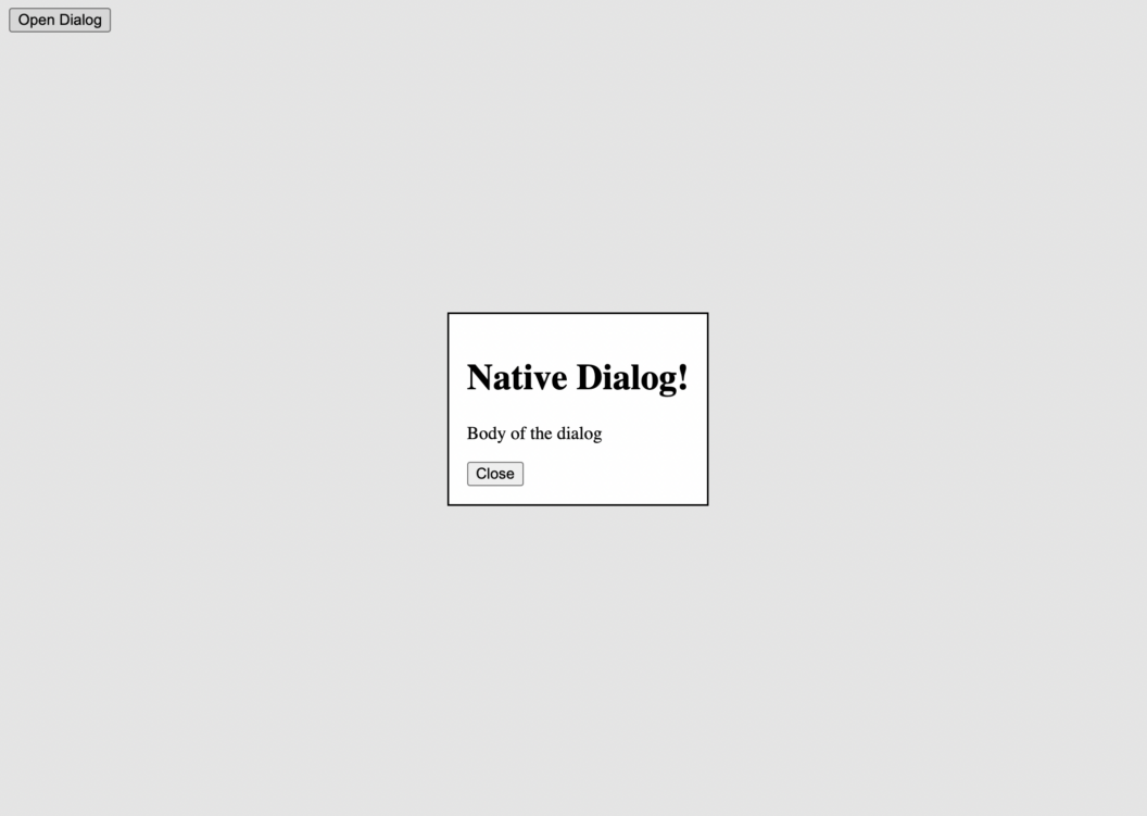
Here’s the simple HTML code for creating and rendering a dialog or a modal using the <dialog> element:
<button id="showDialogBtn">Open Dialog</button>

  <dialog id="nativeDialog">
    <h1>Native Dialog!</h1>
    <p>Body of the dialog </p>
    <button id="closeDialogBtn">Close</button>
  </dialog>

<script>
    const showDialogBtn = document.getElementById('showDialogBtn');
    const nativeDialog = document.getElementById('nativeDialog');
    const closeDialogBtn = document.getElementById('closeDialogBtn');

    showDialogBtn.addEventListener('click', () => {
      nativeDialog.showModal();
    });

    closeDialogBtn.addEventListener('click', () => {
      nativeDialog.close();
    });

</script>
The methods showModal and close are available by default on the <dialog/> element and we can just invoke them to open and close the modal. We use a button to create a trigger for the modal here, but you can change the trigger to anything, like hovering on an element or even opening a different URL or tab on a page. Let’s see this modal in action now:
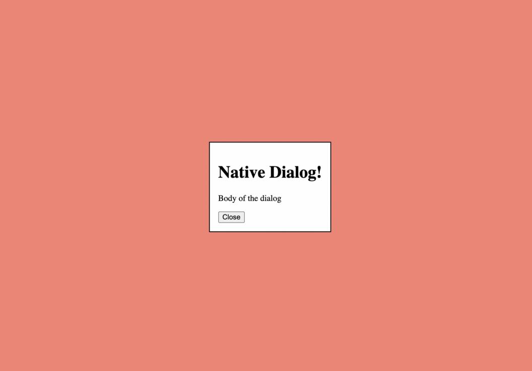
You can also use the open attribute on the <dialog> tag to keep the dialog open by default as shown below:
<dialog open>
  <h1>This is a dialog </h1>
  <p>This will auto open </p>
</dialog>
If you’re thinking using the <dialog> tag limits your ability to customize it’s backdrop, you can use the ::backdrop pseudo-selector on the element to style the backdrop as you want:
dialog::backdrop {
  background-color: salmon;
}
And now you should have a dialog that has a background color of salmon as shown:
If you’re curious feel free to play around with the codepen for this section.
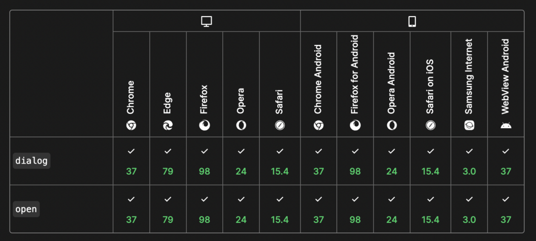
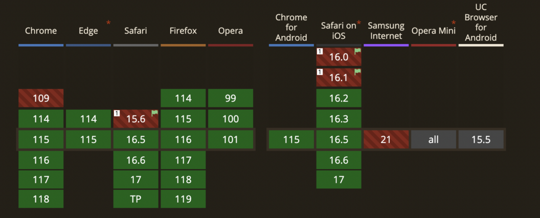
Browser Support
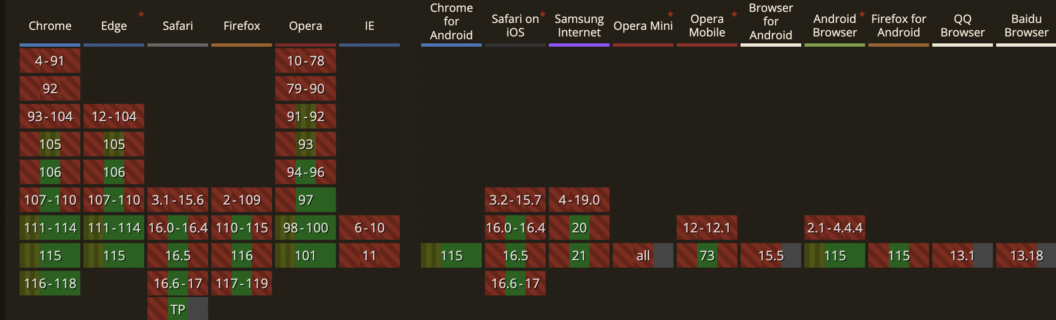
Any new modern web feature will be tempting to use in your application. However, it’s important to understand how well it’s supported across various browsers. This will not only be a big deciding factor if you should actually use a feature but will also help you figure out the necessary polyfills if you decide to use this feature in production.
The following chart shows you from which versions of which browser support the <dialog> tag and the open attribute. The browser support for this feature is pretty solid and it’s only going to go upwards from here.
2. Native HTML Popovers
Similar to modals, popovers prove highly advantageous for displaying additional information conditionally. They effectively present content triggered by specific events. However, a significant distinction between popovers and dialogs lies in their positioning. Popovers are positioned at the topmost layer of a webpage, and they typically lack a backdrop, granting users the freedom to engage with the underlying content.
A common application of popovers is in the form of tooltips. Tooltips excel in guiding users through features, particularly during onboarding and introductory tours. You can also use popovers to create menus to show a list of operations or actions associated with a trigger like a button click. Another classic use-case of popovers is making toast notifications. However, akin to dialogs, developing personalized popovers is a vexing endeavour, entailing arduous construction, testing, and implementation efforts. You will need to write some JavaScript logic to conditionally hide and show the popover or use some fancy CSS trick to do so.
Due to their diverse and much-wanted use cases, native popovers are coming to the web soon. As of now, you can only use them by setting the relevant experimental flag. So let’s explore that first.
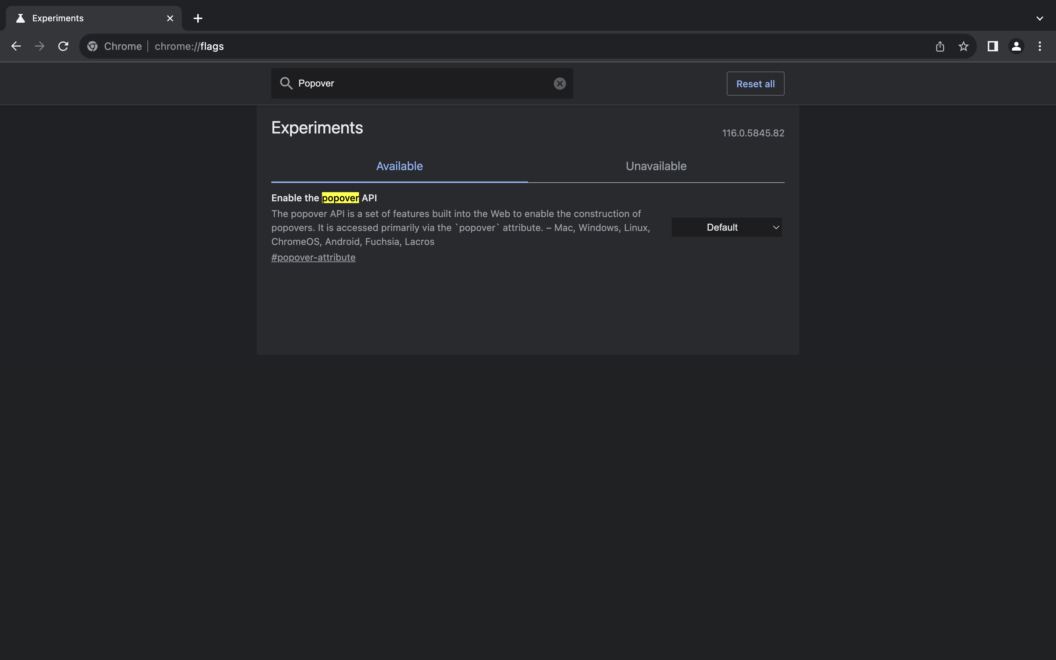
Enabling Experimental Features in Web
First, you’ll need to download Chrome beta. After that, open the Chrome beta browser and in the URL bar type chrome://flags. That should land you on the following page:
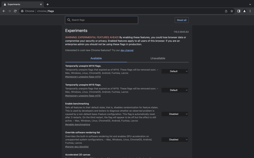
Great! Next, in the Search flags bar type “Popover”. You can also search for any other experimental feature here.
The Experiments tab will then show you the Popover API available. Click on the menu that has Default selected and select Enable. After that, Popover API will be enabled in this browser.
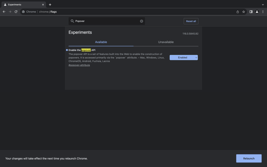
Awesome! Now you can write and test any code that involves the Popover API.
Using the Popover API
Here’s how you can use a simple button to display a popover on the screen. The popover trigger can be set using the attribute popovertarget. The value of this attribute needs to be the id of the popover element. You need to use the popover attribute on your popover element to tell the webpage that this element is a popover:<button popovertarget=”my-popover”>Help</button> <div popover id=”my-popover”>This is the help section</div>
As you can see, our <div> is the popover element with the popover attribute set and an id my-popover. We then set this id as the value of the popovertarget attribute on the button element to trigger the popover.
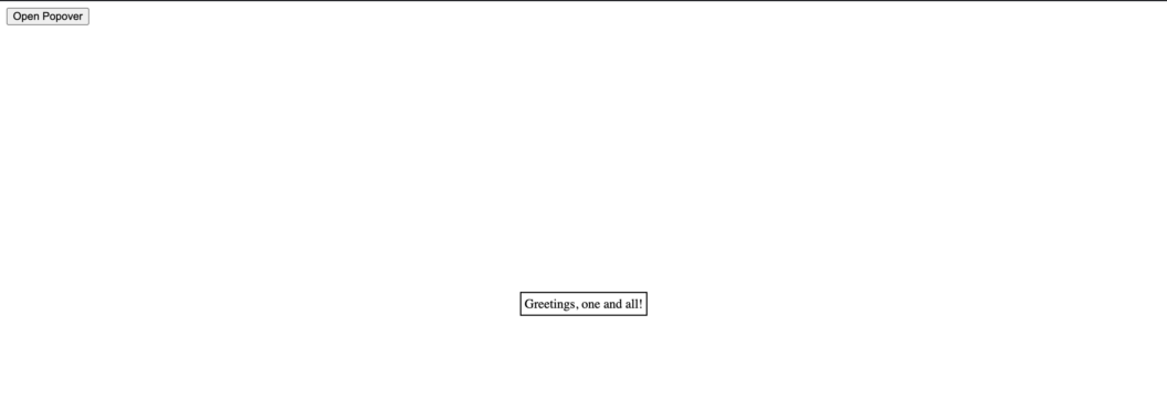
The best part about this is we no longer need to maintain any state or write any JavaScript to hide and show the popover. We also have the methods hidePopover, showPopover and togglePopover that we can use to programmatically hide, show or toggle the popover states.
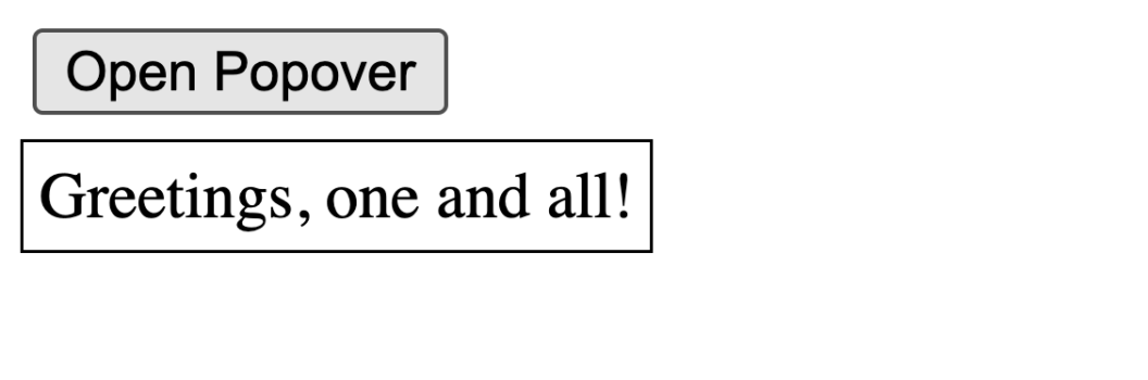
Further, you can use the :popover-open pseudo element to position the popover wherever you want. Let’s say we want to position this popover to create a tooltip, we can write the following CSS to acheive this:
:popover-open {
    position: absolute;
    inset: unset;
    top: 10%;
    left: 5px;
    margin: 0;
}
And now your popover should be positioned like a tooltip as shown below:
Feel free to play around with the codepen for the popover or learn more about the Popover API on the official documentation. I hope you’re just as excited to start using the Popover APIs on your production applications as I am!
3. Container Queries for Responsiveness
Modern web applications seamlessly adapt to various devices – desktops, laptops, tablets, and mobiles – by embracing responsive design principles. This ensures optimal presentation across diverse screen sizes and dimensions. Typically, developers incorporate media queries in their CSS to dynamically style HTML elements or containers based on a device’s viewport. However, a significant challenge arises when the focus shifts from viewport dimensions to the dimensions of a parent container.
Problem with Media Queries
Media queries serve to style elements according to the dimensions of the web browser’s viewport, encompassing both width and height. Yet, a notable limitation of media queries arises in their exclusive fixation on the viewport width. It becomes necessary to predetermine device widths and direct attention to designated screen sizes and orientations. For layouts that are more dynamic in nature and where responsiveness depends on a container element rather than the device viewport width, media queries can pose a significant challenge.
Advantages of Container Queries
Container queries allow you to use any element on your page as a container. Then the container can have its own widths that you can use media queries on. They’re extremely helpful when you’re creating responsive cards, and dynamic responsive layouts such as a blog page that has some posts on the right, a sidebar on the left, to name a few. With container queries, you can set a parent container and then define media queries based on the dimensions of that container, rather than the entire viewport.
Using Container Queries
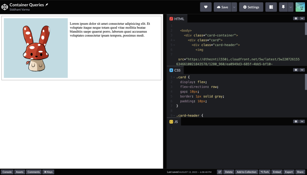
Let’s create a responsive card using container queries. Here, we have a simple HTML template for a card:
<body>
    <div class="card-container">
      <div class="card">
        <div class="card-header">
          <img
          src="https://dthezntil550i.cloudfront.net/5w/latest/5w2207261556346610021843578/1280_960/ea0949d3-685f-4bb5-bf10-d8a8024f461d.png"
  />
        </div>

        <div class="card-body">
          <p>
            Lorem ipsum dolor sit amet consectetur adipisicing elit. Et voluptate
            itaque neque totam quod vitae mollitia beatae blanditiis saepe quaerat
            porro, laborum quasi accusamus voluptates consectetur ipsam tempora,
            possimus modi.
          </p>
        </div>
      </div>
    </div>
</body>
And then some CSS to style this card:
.card {
  display: flex;
  flex-direction: row;
  gap: 10px;
  border: 1px solid gray;
  padding: 10px;
}

.card-header {
  max-width: 400px;
}

img {
  width: 100%;
  height: 100%;
  object-fit: cover;
}
Here’s how this should look like:
Now, we’ll grab the div with the class name card-container and give it a style of container-type:inline-size :
.card-container {
  container-type: inline-size;
}
When setting a container-type to a container, it allows you to define container queries on that element. The value of this property can be either size or inline-size. Now, let’s add a media query to this specific container:
@container (max-width: 500px) {
  .card {
    flex-direction: column;
  }
}
Now when your container becomes smaller than 500px, the card’s layout will change from flexbox row to a flexbox column as shown below:
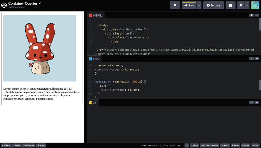
You can experiment more with this example on it’s codepen.
Now you can set any responsive styles on this specific container as you like. The important thing to note here is that these styles will only apply to your container because now your media query is defined on the dimensions or width of a specific container, instead of the entire viewport. How awesome is that!
Browser Support
Container queries now enjoy extensive support, particularly across contemporary web browsers such as Chrome and Edge, albeit with comparatively less endorsement from Safari and Firefox. Their robust presence extends to Chrome for Android and the Android browser. Nonetheless, strides are yet to be made in gaining compatibility with other mobile browsers. Nevertheless, it’s worth learning about container queries and implementing them for specific segments of your application, primarily catering to users who access it through well-supported browsers.
4. CSS Color Mix
Color Mix is an amazing feature in CSS that now lets you mix two colours together. It sounds almost too good to be true so let’s jump right into some examples and explore in detail.
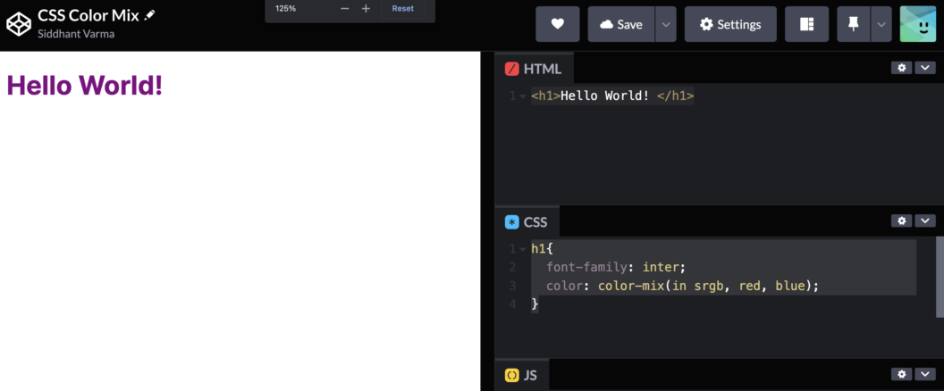
Here’s a simple <h1> tag:
<h1>Hello World! </h1>With some styles:
h1{
  font-family: inter;
  color: color-mix(in srgb, red, blue);
}
And now if you see the <h1>, it appears in the purple colour:
Let’s break the color-mix function again. We have three arguments passed to this function. First, we specify in which space we want to mix these colours. Here we have used the srgb space. Then, we pass the two colours one by one that we need to mix together. Let’s look at another example:
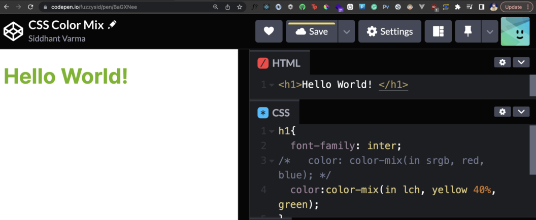
In the above example, we use a different space lch and also specify the percentage of the colour we want to mix which in the above case is 40% for yellow. The color-mix property can be extremely useful in a bunch of scenarios such as generating
The use cases for this property are endless. You can use it to generate dynamic gradients, engaging hover transitions, or image overlays. It’s also widely supported on almost all modern browsers so you can safely use it in production applications.
5. CSS Nesting
Nesting CSS selectors allow you to write cleaner and easy-to-understand CSS. Nesting wasn’t originally built into CSS. In fact, for years I’ve preferred to use a CSS pre-compiler like SASS or LESS to use features like nesting CSS rules but now it’s finally implemented into our browsers.
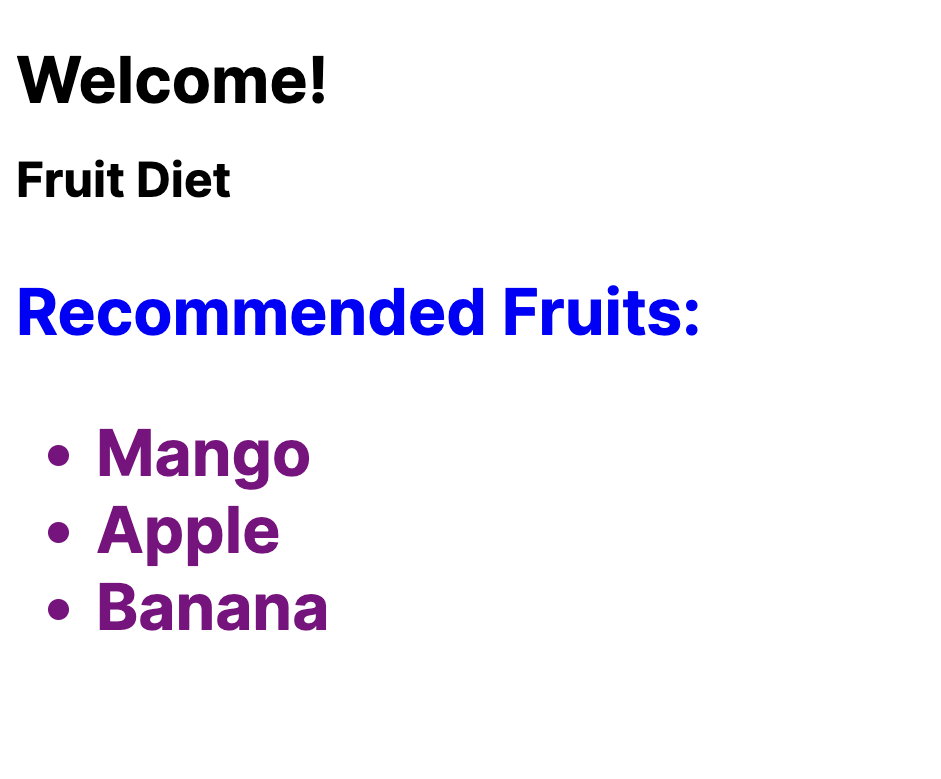
Let’s also dive into this directly with an example. Here, I have the following HTML code:
<div class="title-container">
  <h1 class="title"> Fruit Diet </h1>
 <div>

 <div class="content">
     <p> Recommended Fruits:
    <ul>
      <li>Mango</li>
      <li>Apple</li>
      <li>Banana</li>
     </ul>

</div>
Here’s how I would set the following styles to it without CSS nesting:
.title-container>.title{
	font-size:24px;
}

div.content>p{
  color:blue;
}

div.content>ul>li{
 color: purple;
}
Here’s what that would result in:
And now, let’s use the CSS nesting rule to re-write the above CSS:
.title-container{
  .title{
    font-size:24px;
  }
}

div.content{
  >p{
    color:blue;
  }
   >ul{
      >li{
      color:purple;
      }
   }
}
It seems like we’ve used more code with nesting, but it definitely looks more readable and easy to understand. You can try out this example yourself on it’s codepen. Not only does nesting organizes your code better, but it also helps you reduce your file size and ship your styles to your users faster. The best part is that nesting is widely supported in almost all modern browsers! This is literally a game-changing feature for me as a front-end developer who has to dangle with styling elements in a deeply nested DOM tree. How do you feel about this?
Conclusion
In this blog post, we explored 5 exciting modern web development features that have the potential to revolutionize web projects. From native HTML dialog and popovers to container queries, these advancements offer a plethora of possibilities for creating more efficient, visually appealing, and high-performing web applications. As a front-end web developer, embracing these new features and continuously learning about emerging technologies will empower you to stay ahead in this ever-evolving field.

Thank you for such an insightful blog. We would be glad to share with you more about related services, for more details https://www.prodigit.in/
Exploring modern web development features unveils exciting advancements, enriching user experiences and empowering developers. Embracing innovation for digital excellence!